Every year, big data grows bigger—but making sense of what’s hidden inside billions of rows and signals is getting harder. That’s why data visualization tools matter more than ever: they turn raw numbers into charts, dashboards, maps, and stories that people can actually understand and act on.
As data piles up, teams naturally start asking: Which metrics matter most? What trends are emerging? Where are we winning or leaking value—and how does any of this connect to business goals? With so many data visualization tools available, choosing the right one can feel overwhelming.
In this top tools list, we’re sharing 24 of the best data visualization tools, along with their key features and pricing, to help you find the right fit—whether you need executive dashboards, marketing reports, interactive charts, or developer-friendly visualization libraries.
1. Microsoft Power BI

Power BI, by the computer giant Microsoft, is a data visualisation and analytics tool. It enables you to connect to a wide range of data sources, create custom dashboards, and generate thorough reports. It is compatible with both mobile and online.
Key Features:
-
Individuals to the corporation as a whole can use this analytics platform.
-
Hundreds of data visualisations, built-in AI features, tight Excel interaction, and prebuilt and bespoke data connectors help you find and share relevant insights.
-
With industry-leading data security capabilities, you can keep your data safe.
Cost:
Packages start at $9.99 per user per month.
2. Leaflet
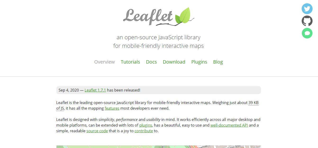
Leaflet was created with ease of use, performance, and functionality in mind. It runs smoothly on all major desktop and mobile platforms, can be extended with a large number of plugins, has a beautiful, well-documented API, and simple, legible source code that is a pleasure to contribute to.
Key Features:
-
Custom map layers and controls have a simple interface.
-
Animation of zoom and pan.
-
Fade animation for tiles and popups.
-
It's really quick thanks to smart polyline/polygon rendering with dynamic clipping and simplification.
-
It's quite light.
Cost:
This tool is available for free.
3. Looker

Looker is a data visualisation tool that makes it simple to explore, analyse, and share data. This application can help you turn your data into helpful diagrams. It is an intelligent generator of insights from pure data.
Key Features:
-
With technologies that allow for deeper research, you can increase your impact and tell a more captivating tale.
-
Data visualisations and dashboards allow you to dive deep into your data while keeping a secure, bird's-eye view of your operations.
-
Dashboards can be used to dynamically filter for individuals or groups.
Cost:
You can get a quote after requesting a demo on their website.
4. Tap Clicks
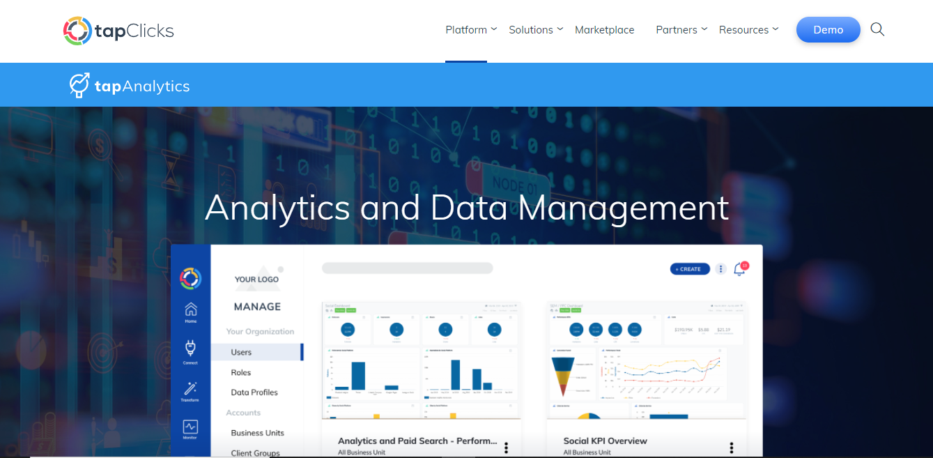
Tap Clicks provides ultimate visualization control owing to its highly intuitive dashboard which is perfect for marketing analysis.
Over 150 data connectors are supported. White label and bespoke branding, automatic marketing reports, export to different formats, over 100 platform connectors, configurable views, and custom performance alerts are some of the standout features.
Key Features:
-
Divide and group data based on characteristics you choose, such as location, to make marketing and operations more efficient.
-
Visualize, compare, and exchange performance sets after normalising naming conventions.
-
Create custom metrics to demonstrate value, as well as KPIs for stakeholders.
-
You don't have to show just the end goal when it comes to Goals and Pacing. You may keep track of your progress at any moment.
Cost:
Packages start at $399 per month.
5. Chart.js
Chart.js is a simple and flexible visualisation tool. It is also completely free of charge because it is maintained by an open community. Another notable feature is the ability to view data in eight distinct ways, as well as good scale granularity.
Key Features:
-
Groups of layout boxes can be stacked and weighted.
-
A secondary title plugin that has all of the same features as the main title plugin.
-
Any user-defined criterion can be used to style line segments.
-
Every property in every element has its own set of transitions that may be specified separately.
Cost:
This tool is available for free.
6. Cluvio
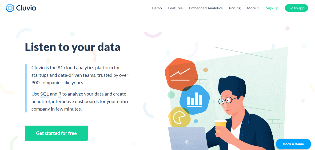
Cluvio is fantastic cloud-based analytics and visualisation application aimed mostly at startups and data-driven organisations. It allows you to easily create stunning, dynamic dashboards. For analytics, it employs SQL and R. Links to these dashboards can be shared. It also has filtered views and visual discovery tools.
Key Features:
-
Professional charts and graphs may help you turn raw data into real stories.
-
Sharing your dashboards with colleagues and clients is simple thanks to advanced user control and private sharing links.
-
Simply send a secure sharing link to others to share dashboards. Anyone can visit the dashboard without needing to log in using that link.
Cost:
Pricing starts at $279 per month.
7. Sigma JS

Sigma JS is a graph sketching library written in JavaScript. It allows developers to integrate network exploration into rich Web applications and makes it simple to publish networks on Web pages.
Sigma promises to assist you in displaying networks on the Web, ranging from simple interactive network publishing to sophisticated Web applications with dynamic network exploration.
Key Features:
-
Sigma's default configuration takes care of mouse and touch support, refresh and rescaling when the container's size changes, and WebGL rendering if the browser supports it.
-
Sigma comes with a plethora of options for customising how you draw and interact with networks.
-
Modifying data, moving the camera, refreshing the rendering, and listening to events are all available with the public API.
Cost:
This tool is available for free.
8. High Charts
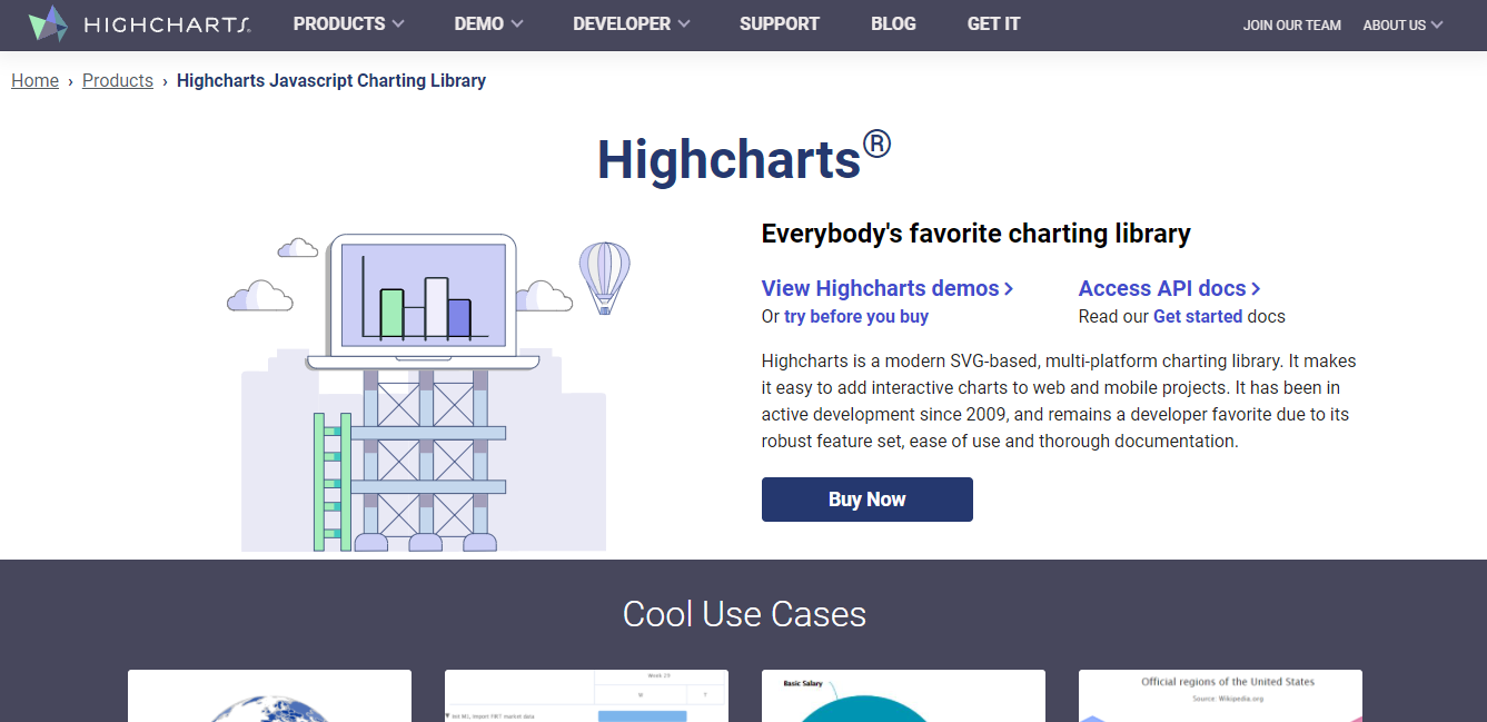
High Charts is a multi-platform charting framework based on SVG. It makes adding interactive charts to online and mobile projects a breeze. It has been constantly evolving since 2009 and there are several features being added with each update.
Key Features:
-
All of its charting libraries are compatible with any database or server stack on the back end.
-
The Highcharts NPM package includes auto-complete code with integrated documentation for TypeScript-capable editors, as well as type checking for most Highcharts parameters and functions.
-
Developers can add annotations to charts or data points to characterise them by drawing simple shapes and text anywhere on the canvas or tied to specific data points.
Cost:
You can request a quote on their website.
9. FusionCharts Suite XT
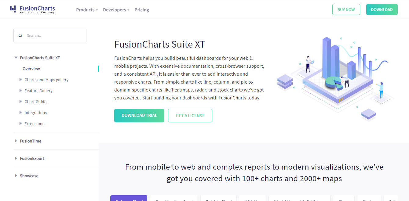
Fusion Charts makes it easy to create stunning dashboards for your web and mobile projects. It's easier than ever to build interactive and responsive charts thanks to detailed documentation, cross-browser compatibility, and a standard API.
Key Features:
-
For your reports and dashboards, it includes the most often used charts, such as column, line, and pie.
-
It adds a lot of information to your dashboards and monitors, from gauges and KPIs to funnel and pyramid charts.
-
PowerCharts XT is a collection of advanced charting widgets for domain-specific use, including heat and treemaps, radar, and statistical charts.
Cost:
Packages start at $499 per year.
10. Databox
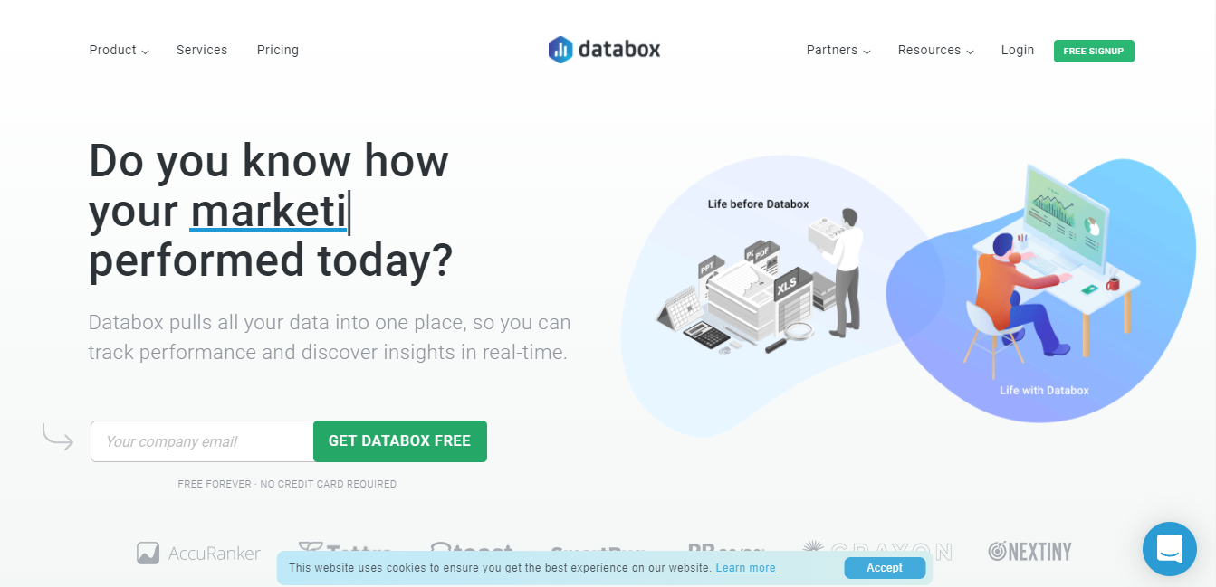
Databox is currently being utilized by more than 13,000 organisations and marketing agencies as their data visualisation tool. Databox brings all of your data together in one place so you can track real-time performance with eye-catching graphics.
Key Features:
-
You don't need to know how to code to create your own dashboards.
-
Set objectives for specific metrics from any of Databox's 70+ integrations or any other data you bring in.
-
With Insights, you can examine a timeline of your team's accomplishments and get suggestions for how to improve your performance.
Cost:
Packages start at $72 per month.
11. Xplenty

Xplenty is a cloud-based data integration platform that prepares data for visualisation. It can pull data from multiple warehouses. It has database, application, and data warehouse connectors, among other things.
Key Features:
-
On the public cloud, private cloud, or on-premise, pull or push data from the most common data sources.
-
Deployments, monitoring, scheduling, security, and maintenance are all taken care of.
-
From basic replication to complicated data preparation and transformation, implement a variety of data integration use cases.
-
Regardless of your users' technical skills, you can easily integrate Xplenty into your data solution stack.
Cost:
You can request a quote on their website.
12. ZOHO Analytics
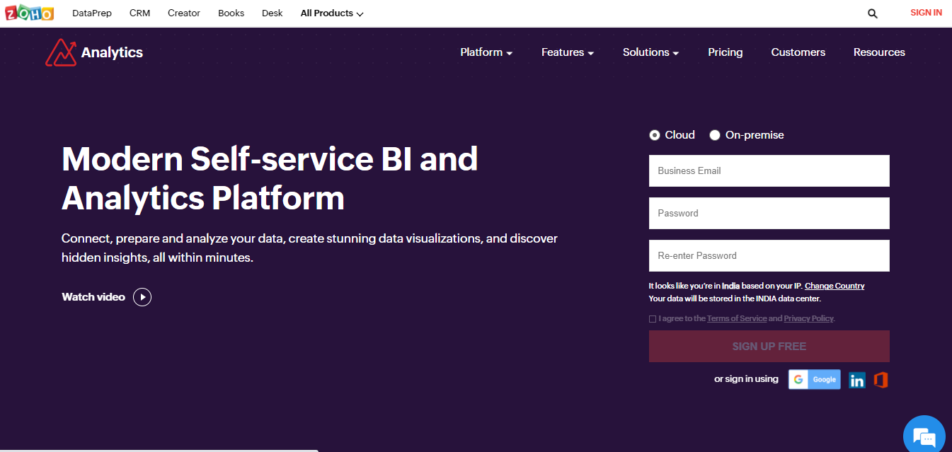
Zoho Analytics is one of the most powerful data visualization tools. One thing you can count on with Zoho analytics is that your data will be safely uploaded. Furthermore, you may transform your data into a compact format using a range of charts, tables, and components.
It is suitable for large as well as medium size enterprises. Some of its high profile clients include Hyundai Motors and Maruti Suzuki.
Key Features:
-
Data from files, feeds, web URLs, databases, business apps, and more can be accessed.
-
Use intelligent suggestions to filter and cleanse data. Remove duplicates and invalid items from your data to improve its quality.
-
Without the requirement for code, you can format and update your data. Use Over 250 transform functions to reshape your data, including unpivot, pivot, and summary.
Cost:
Packages start at $15 per year.
13. Juice Analytics

Juice Analytics makes it easy to build stunning data visualisations that will make you look like a pro.
Juice Analytics is a data visualisation software for consultants and information professionals who aim to satisfy their customers with powerful presentations. It's simple to get started, and there's no need for code or a designer to create a fascinating, interactive data storey.
Key Features:
-
End-users are guided through the data using a unique data storytelling approach.
-
Juicebox is accessible to non-technical users thanks to its simple editing interface.
-
Drill-down data visualisations that are interactive and integrated.
-
Simple styling options create a professional, appealing web design.
Cost:
Packages start at $49 per month.
14. Whatagraph

Whatagraph pricing varies depending on the features you want to use. There's no point in overpaying for features you're not going to use.
Whatagraph makes it simple for marketing organisations to deliver statistics from marketing campaigns to their clients. This technology generates visually appealing statistics that everyone can understand, regardless of who you're reporting to.
Key Features:
-
Combine data from numerous channels, accounts, or campaigns to give your client a clear picture of their success.
-
Deliver reports to your clients on a regular basis. You will receive a quick summary of the contents before submitting it.
-
Connect custom data to your report with Google Sheets and Public API connectors, and you'll be able to import data from any source.
Cost:
Packages start at $119 per month.
15. Tableau
Tableau is the data visualisation solution for you if you want to see and visualise data quickly. It aids you with the creation of charts, maps, and other professional visuals. You may also use the desktop application to improve your visual representations.
Furthermore, if you have problems installing a third-party software, it offers a “lock the server” approach to allow you visualise reports online or through mobile apps.
Key Features:
-
Tableau delivers endless data exploration without stopping your analysis flow thanks to its built-in visual best practises.
-
Tableau's interactive, analytical features may be embedded and customised to create a seamless experience with your goods.
-
With flexible single sign-on, enterprise-grade security, and out-of-the-box high availability at scale, Tableau connects into your existing technologies.
Cost:
Packages start at $12 per month.
16. Qlik
Qlik is a comprehensive data analytics tool that establishes a new standard for analytics. You can empower everyone in your organisation to make smarter decisions every day with its one-of-a-kind associative analytics engine, advanced AI, and high-performance cloud platform, resulting in a truly data-driven enterprise.
Key Features:
-
Enable any BI use case and give users the freedom to search and explore for insights that query-based BI solutions can't provide.
-
Build sophisticated analytics apps faster with suggestions and automation by combining and loading data, creating smart visuals, and dragging and dropping.
-
With suggested insights and analyses, task automation, search & natural language interaction, and real-time advanced analytics, Insight Advisor supports human intuition throughout Qlik.
Cost:
Packages start at $30 per month.
17. Adverity
Adverity assists agencies and clients in overcoming data issues, reducing manual data gathering and reporting overhead, and developing successful, data-driven campaigns with a high return on investment.
At Adverity, we provide the tools that enable the next generation of marketers to contribute to their company's success to the fullest extent possible.
Key Features:
-
Uncover hidden trends and chances for real-time campaign optimization for optimal ROI.
-
With just a few clicks, you can create compelling and intelligent dashboards that give improved insights right now.
-
To create genuinely compelling reports, modify visuals, chart kinds, widget sizes, table formats, filters, and a variety of other elements with ease.
Cost:
You can request a quote on their website.
18. Infogram
Infogram is a data visualisation and infographics platform that runs on the web. It allows you to create and share infographics, maps, and charts by transforming all user data into visually appealing images.
The graphics can then be shared, embedded, or published wherever you choose. Furthermore, the tool is simple to operate and is appropriate for government agencies, marketing teams, and even students.
Key Features:
-
Templates that are ready to use increase interaction, impress your audience, and seem professional.
-
Create a unique template that incorporates your brand's colours, fonts, and logo.
-
Object animations will let you take your tales to the next level. Set items to seamlessly zoom, bounce, flip, fade, and slide into your work.
-
Robust analytics provide you with precise viewer demographics, an average on-screen rate, and the number of times your content was shared.
Cost:
Packages start at $19 per month.
19. WorkDay Adaptive Planning
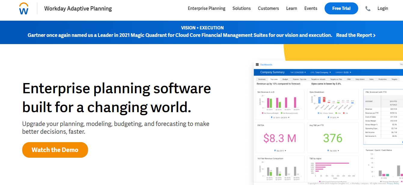
WorkDay Adaptive Planning is a data visualisation tool designed to help you grow your company. It's one of the best data visualisation tools for planning, budgeting, and forecasting to help you make better decisions.
You can plan collaboratively throughout the organisation with Workday Adaptive Planning instead of using manual spreadsheets or bulky outdated solutions. In a fast-paced world, you need business agility.
Key Features:
-
The in-memory engine that gives the power and performance you need—as well as the flexibility to model anything you want—is possible with Elastic Hypercube Technology.
-
Application security, extensive auditing, and encryption all contribute to ensuring secure storage and access at all times.
-
All of your enterprise systems are compatible with the platform.
Cost:
You can request a quote on their website.
20. HubSpot
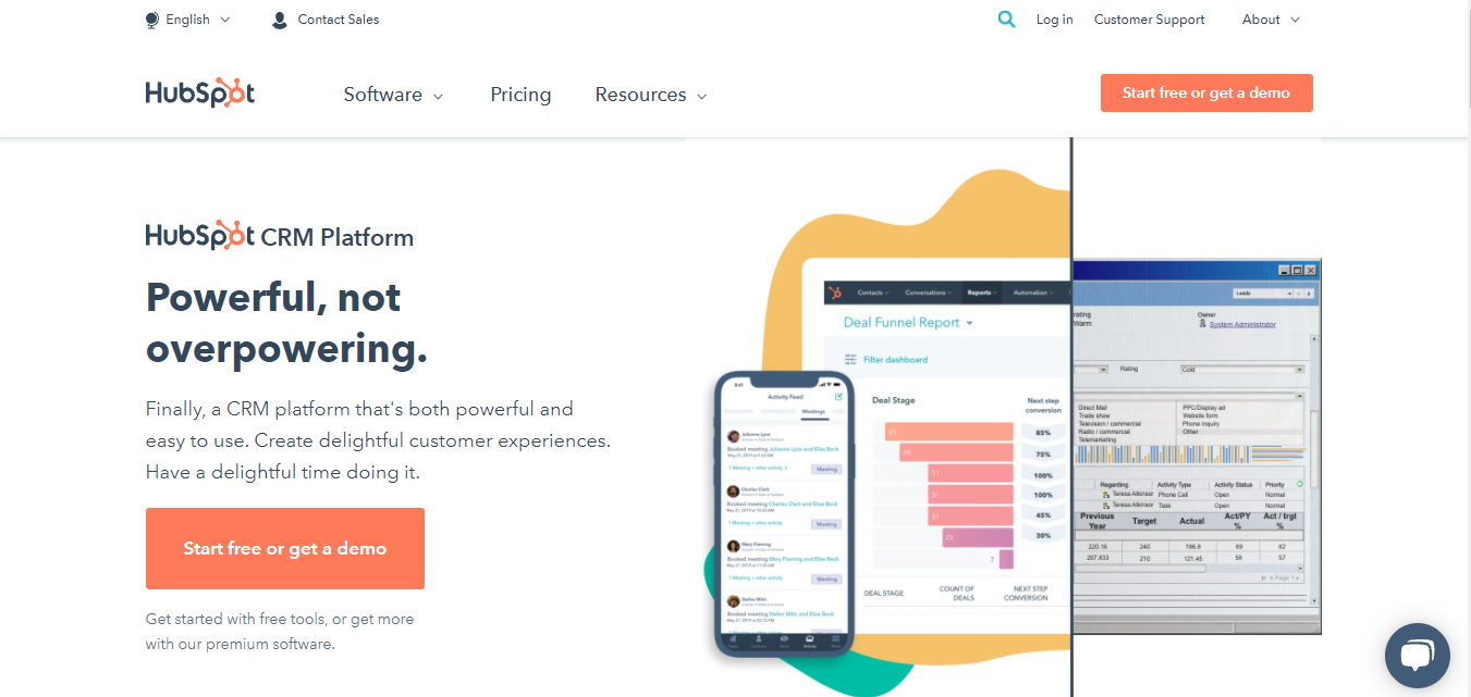
HubSpot offers sales reporting that allows you to see every step of your sales process. HubSpot CRM provides with a collection of critical sales reports. It offers reporting features that are centred on the dashboard. This dashboard will consist of a number of reports. The data range on the dashboard can be changed.
The Sales Hub Professional and Reporting Add-on will provide you with a comprehensive view of the success of the Sales team. It will provide you with a report builder that you can customise. Based on the data, you will be able to develop personalised reports.
Key Features:
-
You may modify who has access to the dashboard using the tool.
-
You can resize individual reports based on your team's priorities.
-
There are ten reports that can be displayed on the dashboard.
-
It's a versatile and powerful tool for creating bespoke reports.
Cost:
Packages start at $800 per month.
21. Data Wrapper

Data Wrapper is one of the most innovative data visualisation tools on our list. Whatever style of chart you develop, your target audience should be able to comprehend it. Furthermore, while the excel screenshot appears great on your laptop, it is scarcely readable on a mobile device.
Key Features:
-
From simple bars and lines to arrow, range, and scatter plots, there are 19 dynamic and responsive chart kinds to choose from.
-
You may make everything from location maps to thematic choropleth and symbol maps using three dynamic and responsive map formats.
-
Many design possibilities are available with responsive data tables, including bar, column, and line charts, heatmaps, photos, a search bar, and pagination.
Cost:
Packages start at $599 per month.
22. Dundas BI
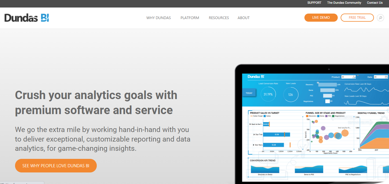
Dundas BI transforms raw data into usable insights in the form of dashboards, reports, and visual data analytics, allowing businesses and software vendors to strike while the iron is hot. With Dundas, you can never miss out on any crucial insights.
Using a full, end-to-end business intelligence, reporting, and data analytics platform that adapts to your exact needs, you can get more value from your data and make key business decisions faster.
Key Features:
-
Dundas BI is a single, open, adaptable data analytics platform that can combine and store data from any source, giving a uniform user experience and seamless data delivery.
-
With minimal IT help, run ad-hoc queries, perform visual data analytics, and quickly create relevant and actionable information that is easy to consume.
-
To improve your users' ability to effectively communicate data insights and promote speedier decision-making, create pixel-perfect dashboards and reports and power them with rich, interactive data visualisations.
Cost:
You can request a quote on their website.
23. D3.js
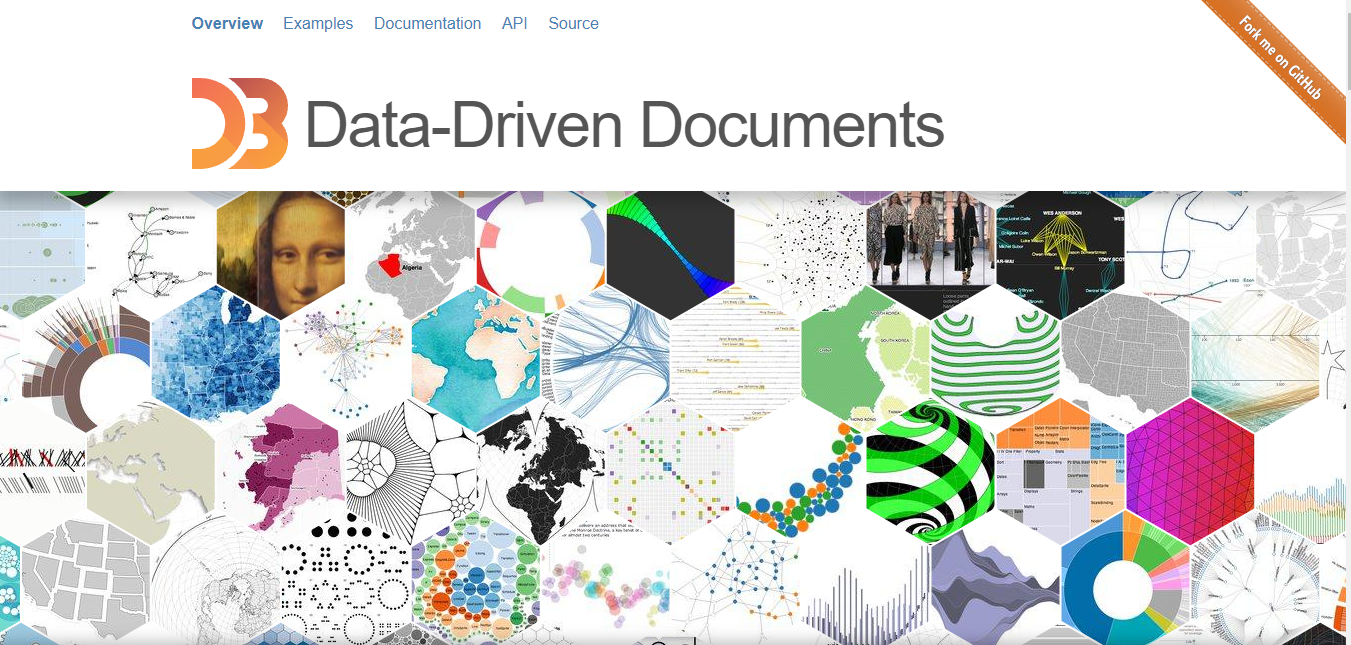
D3,js is a Javascript-based data visualisation tool with a lot of flexibility. It allows you to manipulate documents based on data and provides declarative programming. It also supports big datasets and is extremely user-friendly.
Aside from that, it offers unique features such as code reusability, a large range of curve-generating algorithms, data association with HTML elements, and more.
Key Features:
-
Readers who are familiar with other DOM frameworks, such as jQuery, will see that D3 has a lot in common with them. Styles, attributes, and other properties in D3 can be given as data functions rather than plain constants.
-
You can add new nodes for incoming data and remove exiting nodes that are no longer needed using D3's enter and exit selections.
-
D3's graphical mark vocabulary is based on online standards such as HTML, SVG, and CSS.
Cost:
This tool is available for free.
24. Google Charts

The Google Charts tool, one of the market leaders for data visualization, is widely known for its ability to create graphic and pictorial representations of data. It is coded with SVG and HTML5. In addition to zooming capabilities, Google Charts offers unparalleled cross-platform compatibility with iOS, Android, and even earlier versions of Internet Explorer.
Key Features:
-
Convenient platform
-
Data integration is simple.
-
Data visualization graphs
-
Compatibility with products from Google.
Cost:
Contact the company for the details.
Things to Consider When Choosing a Data Visualization Tool
Make a Distinction Between Presentation Graphics and Exploring Graphics
Presentation graphics are similar to proofs of mathematical theorems in that they may not reveal how a result was arrived at, but they must provide convincing evidence for its conclusion. Exploratory visuals, on the other hand, are used to find out what's going on. They can be used in a large number of ways, and they should be quick and informative rather than sluggish and accurate. They aren't meant to be presented, thus extensive legends and captions aren't required.
Thousands of exploratory graphics may be generated to support one analyst's data investigations, whereas one presentation graphic may be drawn for viewing by thousands of readers.
Before Selecting a Tool, Sketch Out Your Intended Visualisation
It all relies on your talents, the aim of the visualisation, time restrictions, and a whole lot of other aspects when determining which tools to employ, whether it's a ruler, Python, chart creation codes, or a mix of all of these. At the very least, start with a pen and paper.
Strike a Balance Between Functionality and Requirements
Choosing the best data visualisation tool necessitates balancing analyst expectations with technical requirements, defining training schedules, and assessing whether you need to add components to your current technical architecture to satisfy all of your business needs. You may even notice that your requirements compete with one another, or that competing instruments appear to be vying for first place.
Conclusion
Before committing to any data visualization tool, take time to test it in real conditions: try the free plan or trial, request a demo if available, and compare it against alternatives using the same dataset and use case. The “best” tool isn’t always the most popular—it’s the one that fits your workflow, your data sources, and the people who will actually use it.
When evaluating options, prioritize the essentials: ease of use, data connector coverage, dashboard/report flexibility, collaboration and sharing, performance at scale, and security. If your team needs quick insight delivery to stakeholders, a polished dashboard platform may be ideal. If you’re building custom visual experiences in products, a developer-first library might be the better choice.
Ultimately, great data visualization doesn’t just make data look good—it makes decisions clearer, faster, and more confident.
FAQs
What Is Data Visualization?
The graphical depiction of information and data is known as data visualisation. Data visualisation tools make it easy to examine and comprehend trends, outliers, and patterns in data by employing visual elements like charts, graphs, and maps.
Data visualisation tools and technologies are critical in the Big Data environment for analysing enormous volumes of data and making data-driven decisions.
What Are Data Visualization Tools?
Data visualisation technologies make creating visual representations of massive data sets easier for data visualisation designers. When working with data sets including hundreds of thousands or millions of data points, automating the visualisation process makes a designer's job much easier, at least in part.
Dashboards, yearly reports, sales and marketing materials, investor presentation decks, and nearly anywhere else information has to be digested quickly can all benefit from these data visualisations.
When Should You Consider Using Data Visualization Tools?
Data visualisation can help you in any business or job by distributing data in the most efficient way possible. Data visualisation is an important phase in the business intelligence process because it takes raw data, models it, and delivers it so that conclusions may be drawn. Machine learning algorithms are being developed by data scientists in advanced analytics to better assemble critical data into visualisations that are easier to grasp and analyse.
Data visualisation, in particular, employs visual data to express information in a universal, quick, and effective manner. This method can assist businesses in determining which areas require improvement, which factors influence customer satisfaction and dissatisfaction, and what to do with certain items (where should they go and who should they be sold to). Stakeholders, business owners, and decision-makers can better estimate sales volumes and future growth using visualised data.
What Are the Benefits of Data Visualization?
Colors and patterns attract our attention. We can rapidly distinguish between red and blue, and a square from a circle. Everything in our culture is visual, from art and marketing to television and movies. Another type of visual art that piques our curiosity and keeps our gaze fixed on the message is data visualisation.
We can rapidly spot trends and outliers while looking at a chart. If we can see something, we immediately assimilate it. It's purposeful storytelling. You know how much more effective a visualisation can be if you've ever stared at a big spreadsheet of data and couldn't spot a trend.
Why Is Data Visualization Important?
Data analysis in large data sets is difficult, and you can't expect everyone to comprehend it as well as data analysts. The simplest way to communicate analytical results to everyone is through data visualisation. By properly visualising information, you may speed up your business.
What Features Do the Top Data Visualization Tools Share?
Several characteristics are shared by the technologies now available for data visualization. Their ease of use is their primary benefit. You will most likely come across two different kinds of software: those that are simple to use and others that make it very tough to visualize data. Some are built in user-friendly ways and have good documentation, and tutorials. The "best" tools don't include everyone because some people don't possess some attributes, regardless of their other attributes. It is important to confirm that the software is capable of handling a variety of data types and displaying large volumes of information at once.
What are the four different forms of data visualizations?
Common Data Visualization Formats
-
Bar Chart
-
Pie chart or doughnut chart.
-
Line Chart or Line Graph
-
Pivot Table.
-
Scatter Plot.